Kreativni nomadi

We designed a visual identity and it’s guidelines for the association.
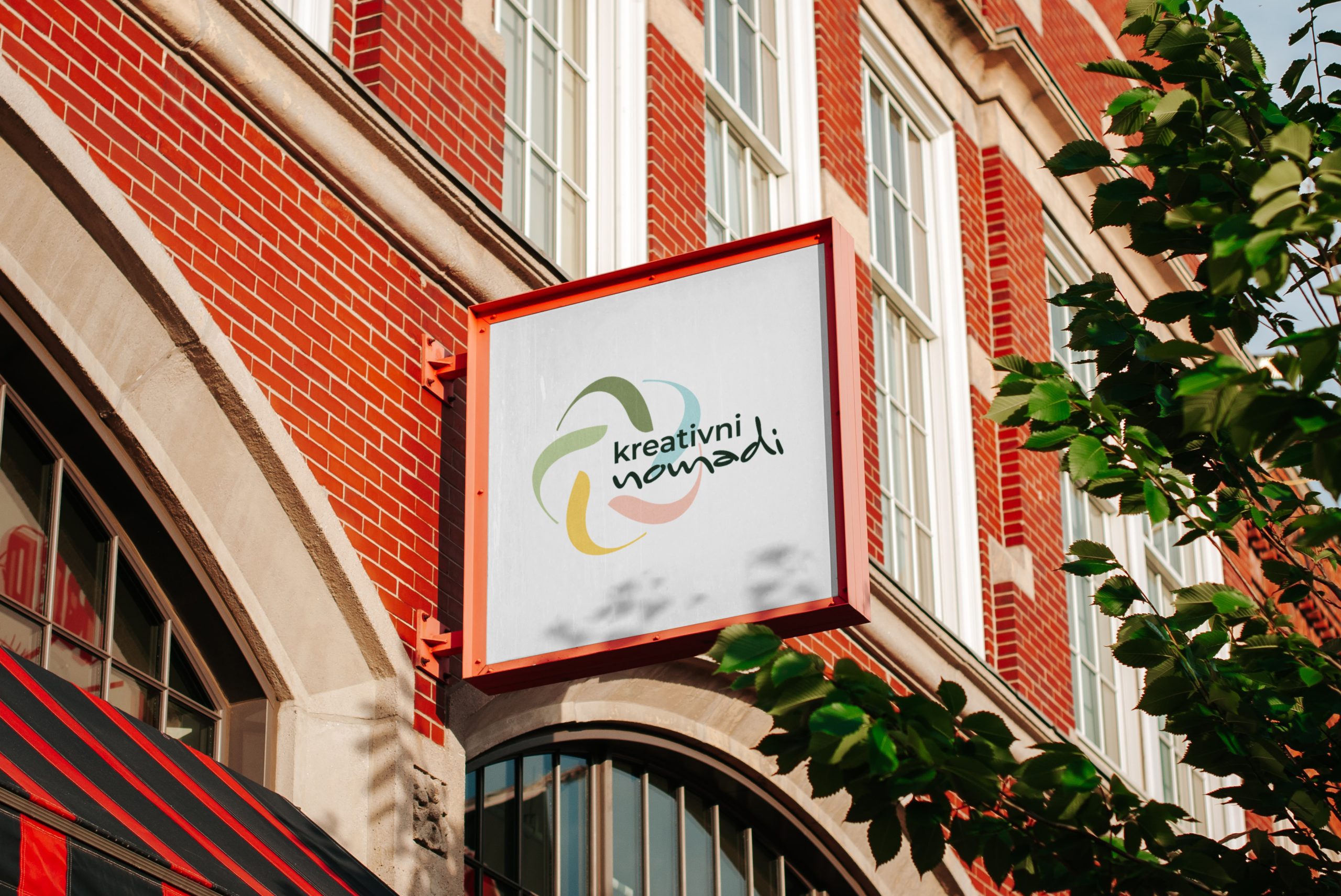
The logo consists of five identical simple petals that repeat and intertwine to form a circle. The petals in the circle are in various soft pastel shades, symbolizing the interconnectedness of people, the coexistence of nature and humans, and the acceptance of diversity. This symbol expresses respect for diversity and the importance of mutual understanding and coexistence in the world around us.
The logo consists of two different fonts, each representing a different aspect of the association. The first is linear and simple, expressing rationality and responsibility. The second is handwritten, giving a sense of playfulness, creativity, and freedom, which are key characteristics of the other side of the association. The logo skillfully shows how these two sides synchronize and complement each other, forming a complete image of the association and expressing its success and diversity.